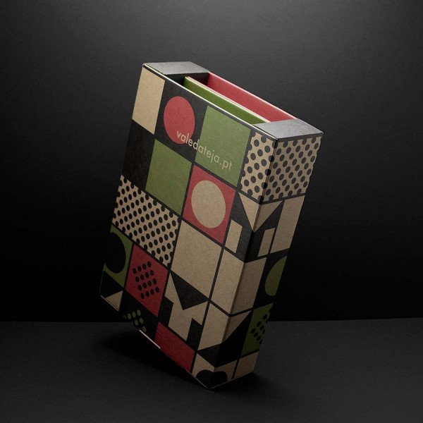
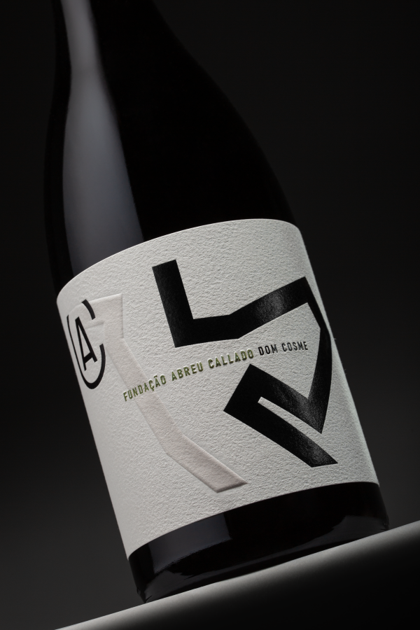
The brand identity project developed for the Vale da Teja Cooperative Winery celebrates the spirit of cooperativism, translating the unity of the winegrowers into a distinctive and contemporary visual language.
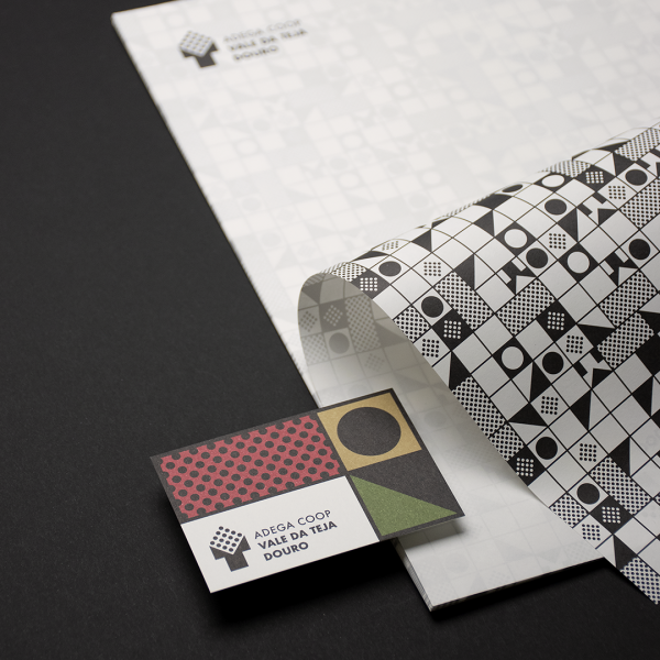
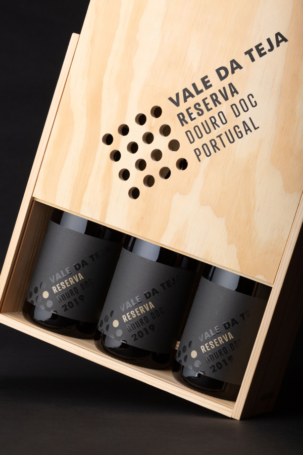
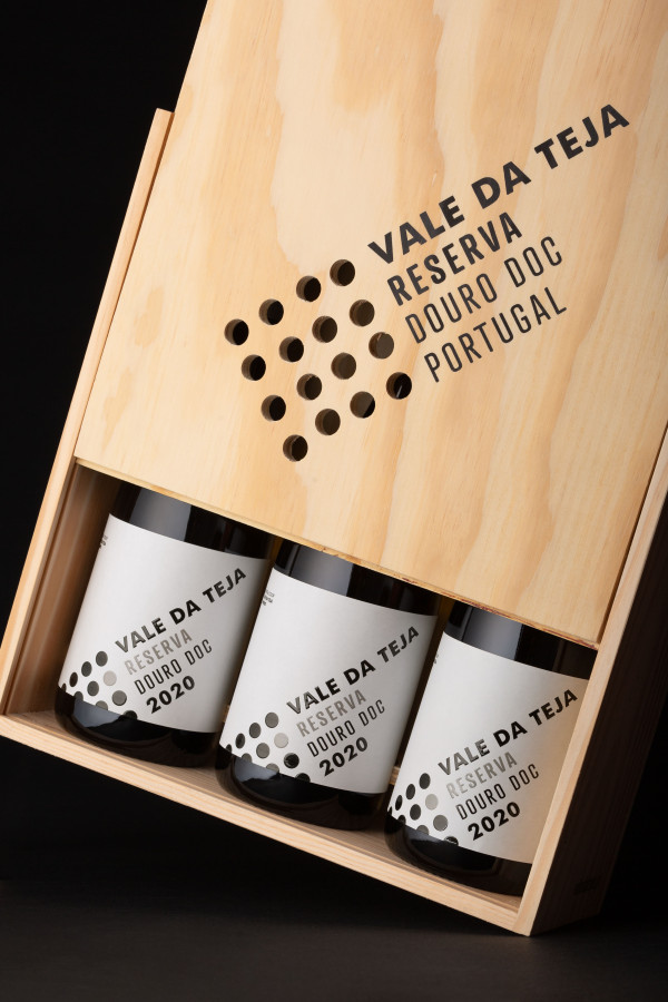
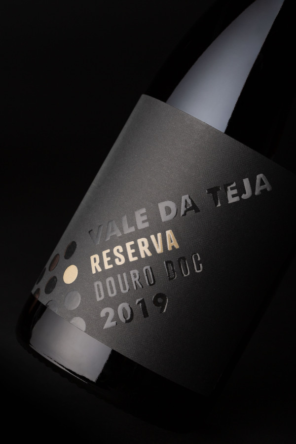
The symbol results from the fusion of the letters ‘t’, for Teja, and ‘v’, for Vale, into a geometric shape that evokes the jetty where the grapes are received. Within it, organised circles represent both the raw material and the group of members that form the cooperative. The concept ‘Strength in unity’ encapsulates this relationship between territory, production and community.
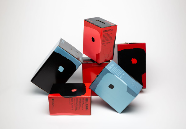
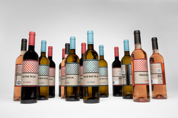
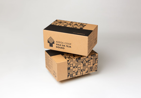
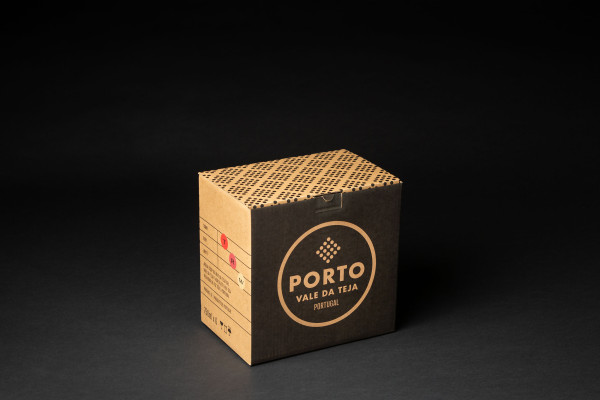
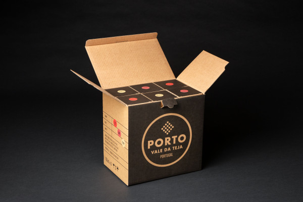
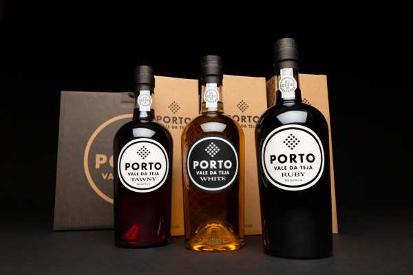
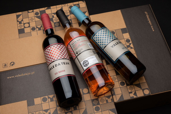
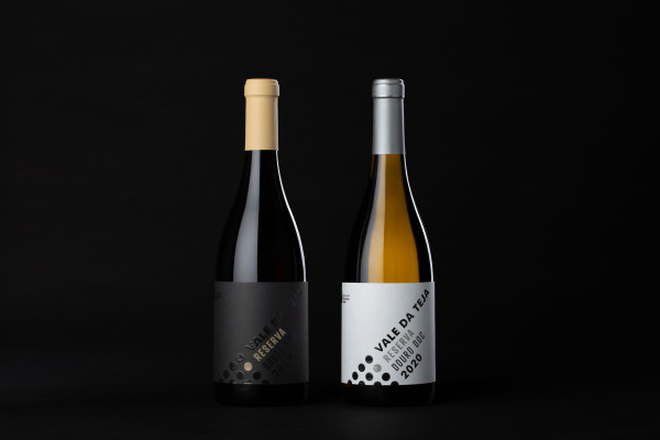
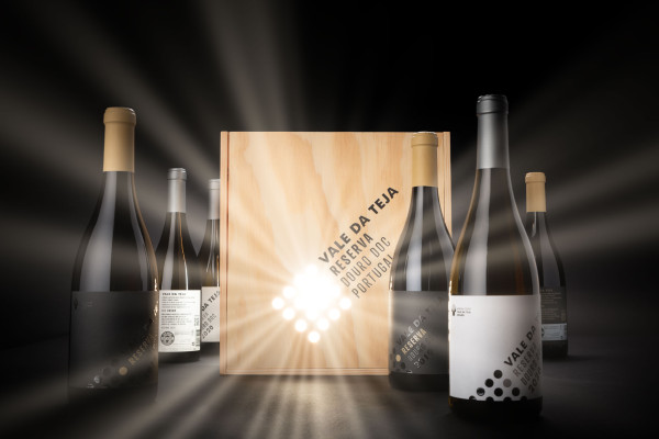
The combination of the symbol with the Futura typeface defines a refined and consistent identity, extended across a system of labels and packaging for the various product ranges, from bag-in-box wines to Colheita, Reserva and Port wines. A common graphic language, with specific variations for each range, ensures consistency and differentiation.
The symbol results from the fusion of the letters ‘t’, for Teja, and ‘v’, for Vale, into a geometric shape that evokes the jetty where the grapes are received. Within it, organised circles represent both the raw material and the group of members that form the cooperative. The concept ‘Strength in unity’ encapsulates this relationship between territory, production and community.
The combination of the symbol with the Futura typeface defines a refined and consistent identity, extended across a system of labels and packaging for the various product ranges, from bag-in-box wines to Colheita, Reserva and Port wines. A common graphic language, with specific variations for each range, ensures consistency and differentiation.